Kure
Designing a Healthcare Platform That Supports Clinical and Business Operations
- Role
- Sr. Product Designer, with product ownership across the web platform
- Scope
- Product strategy, UX, DS, cross-stakeholder workflows
- Platform
- Web + mobile
- Product type
- Internal B2B SaaS / Healthcare operations
Kure is an internal healthcare platform built to support the operational backbone of clinics and hospitals. I led product design across web and mobile, owning experience strategy, system foundations, and multi-stakeholder workflows for a highly regulated, high-complexity environment.
My role focused on translating fragmented, manual processes into a coherent platform that could scale across organizations without breaking trust, reliability, or operational clarity.
How we got to a 60% reduction of time to complete form across the board, on all verticals.
Challenges
Healthcare operations involve multiple user types working under strict regulatory, time, and reliability constraints. At Kure, the challenge was not building features, but designing a system that could support:
- patients
- nurses and doctors
- administrative staff
- recruiters and HR
- financial analysts and executives

Each group had different goals, permissions, and mental models, yet all needed to operate within the same platform.
The existing processes were fragmented, heavily manual, and difficult to scale.
Expectations vs. Reality
A surface-level solution would have optimized individual workflows in isolation. In reality, improving one role’s experience often created friction elsewhere.
Designing Kure required a system-level view: understanding how decisions made for one user type impacted others across the organization, both operationally and financially.
The operational model, mapped. Point at a step (or tap it) to follow where it leads and what leads to it.
Design Strategy & Key Decisions
Decision 1
Designing the system before individual workflows
Rather than starting with screens, I mapped the underlying operational model: roles, permissions, dependencies, and data flows.
This allowed the platform to remain coherent even as complexity increased and new use cases were introduced.
Decision 2
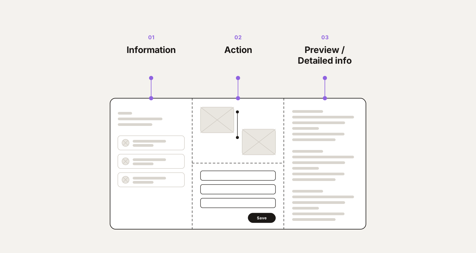
Prioritizing clarity over density
Healthcare systems often collapse under their own complexity.
I intentionally designed for clarity: progressive disclosure, strong hierarchy, and predictable patterns, even when it meant resisting feature density.
This reduced cognitive load for frontline staff while keeping the system powerful enough for advanced users.
Decision 3
Building reusable patterns across web and mobile
Kure needed to function consistently across devices without duplicating effort or logic.
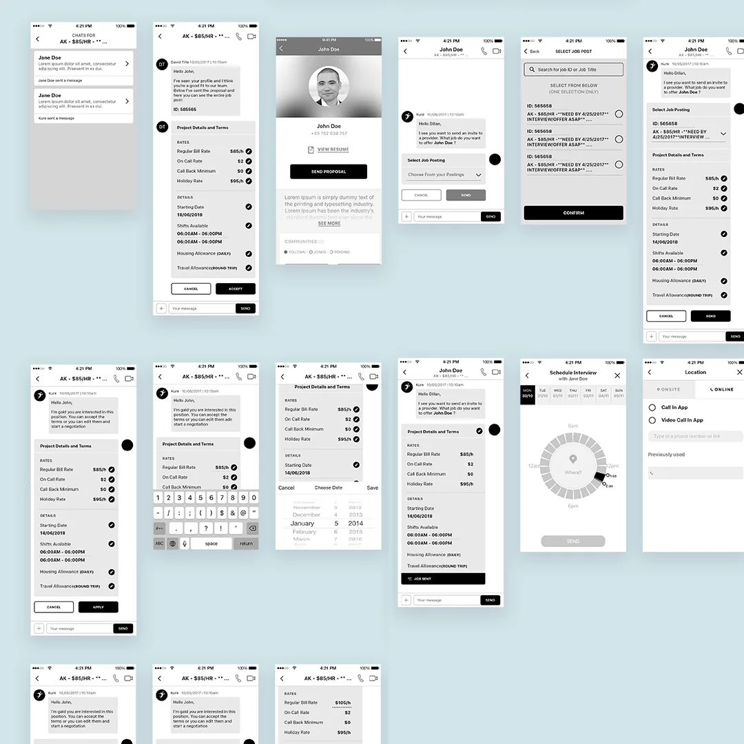
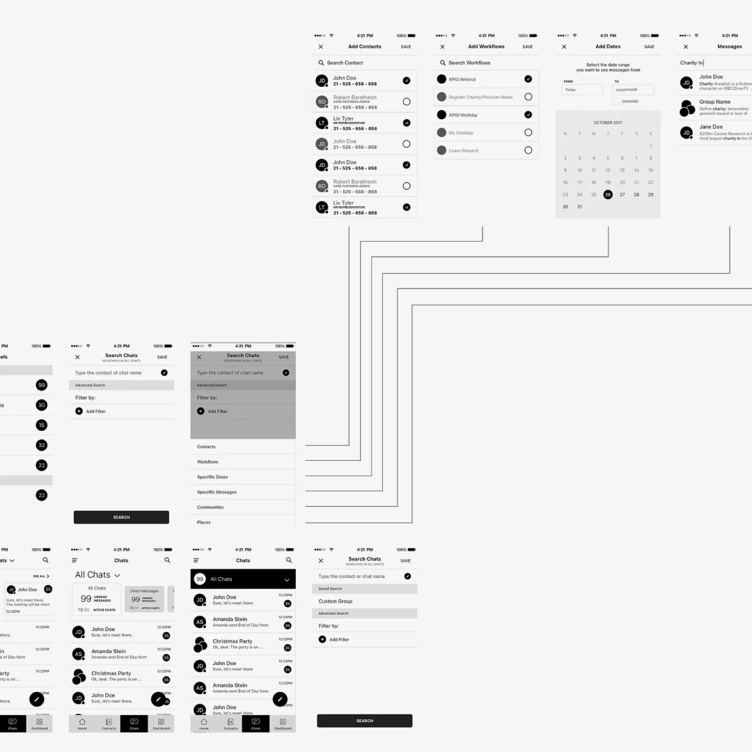
I focused on shared patterns, components, and interaction principles that could scale across web and mobile while respecting each platform’s constraints.
This improved maintainability and reduced long-term design debt.
Wireframe
Therapist
Patient
Design tokens
Colour
- Ink
#3a437d - Action
#27b4db - Band
#eaf5f7 - Line
#b9cfd4 - Arrived
#78c14e - Canceled
#e1573f - Scheduled
#9cc2cb - Claim open
#6196cf - Claim approved
#749e56 - Claim denied
#dac038
Chip states
- Visit Arrived/Completed
- Visit Canceled/No Show
- Visit Scheduled
- Claim for Visit Not Released
- Claim Released | Status Pending Approval
- Claim Approved | Status Approved Amount Column Filled
- Claim Paid | Status Paid Amount Column Filled
- Claim Denied | Status - Not Worked
- Claim Denied | Status - In Queue
- Claim Denied | No More Reconciliation
Impact
- $12M+
- in annual revenue supported through improved operational efficiency
- 13+
- Clinics in North Carolina, US, using the platform
- 3+
- Hospitals in India using the platform
- 60%
- Reduction of time to complete form across the board, on all verticals
From Strategy to Execution
Design execution focused on supporting real operational workflows, not idealized user journeys.
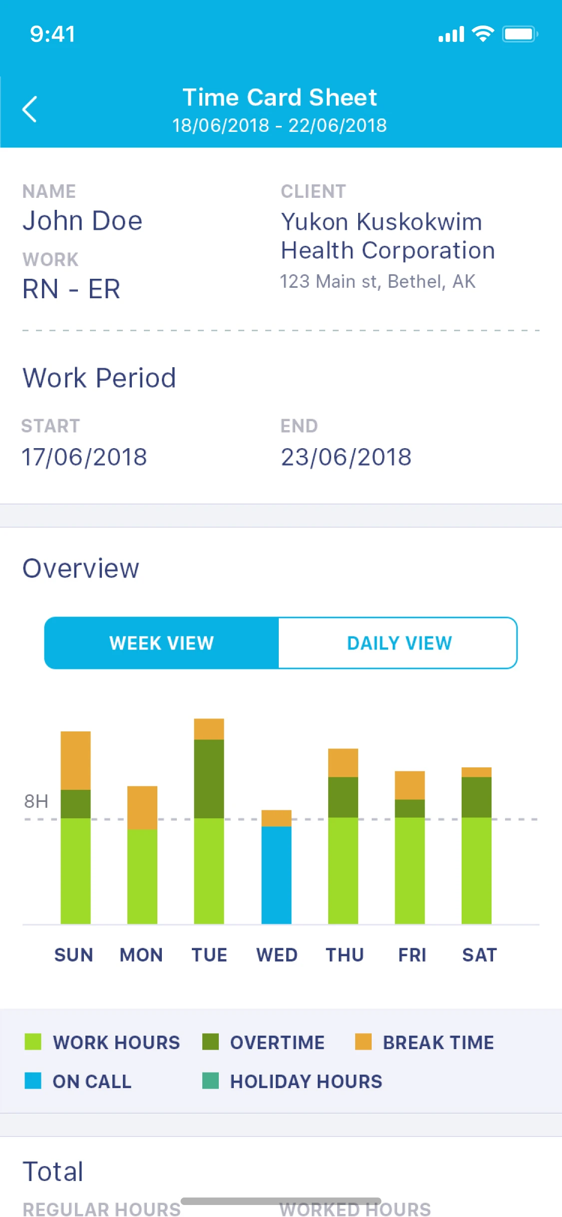
Operational Dashboards
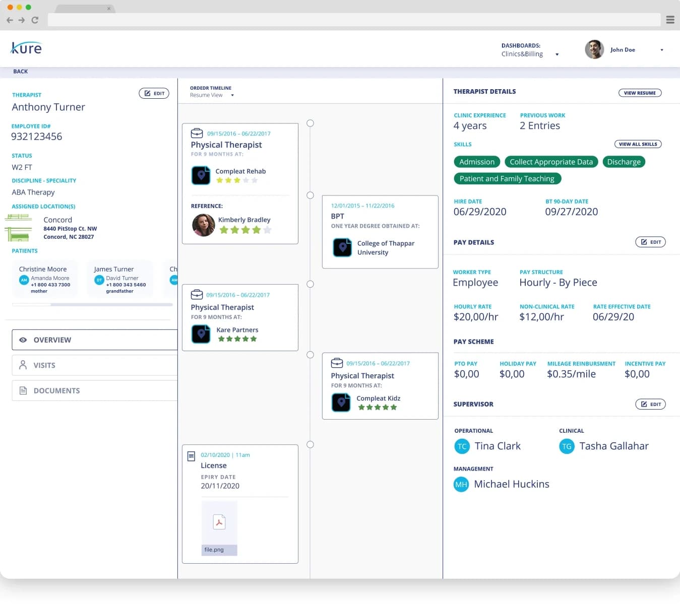
Designed to surface the right information at the right time for different roles, reducing dependency on manual reporting.
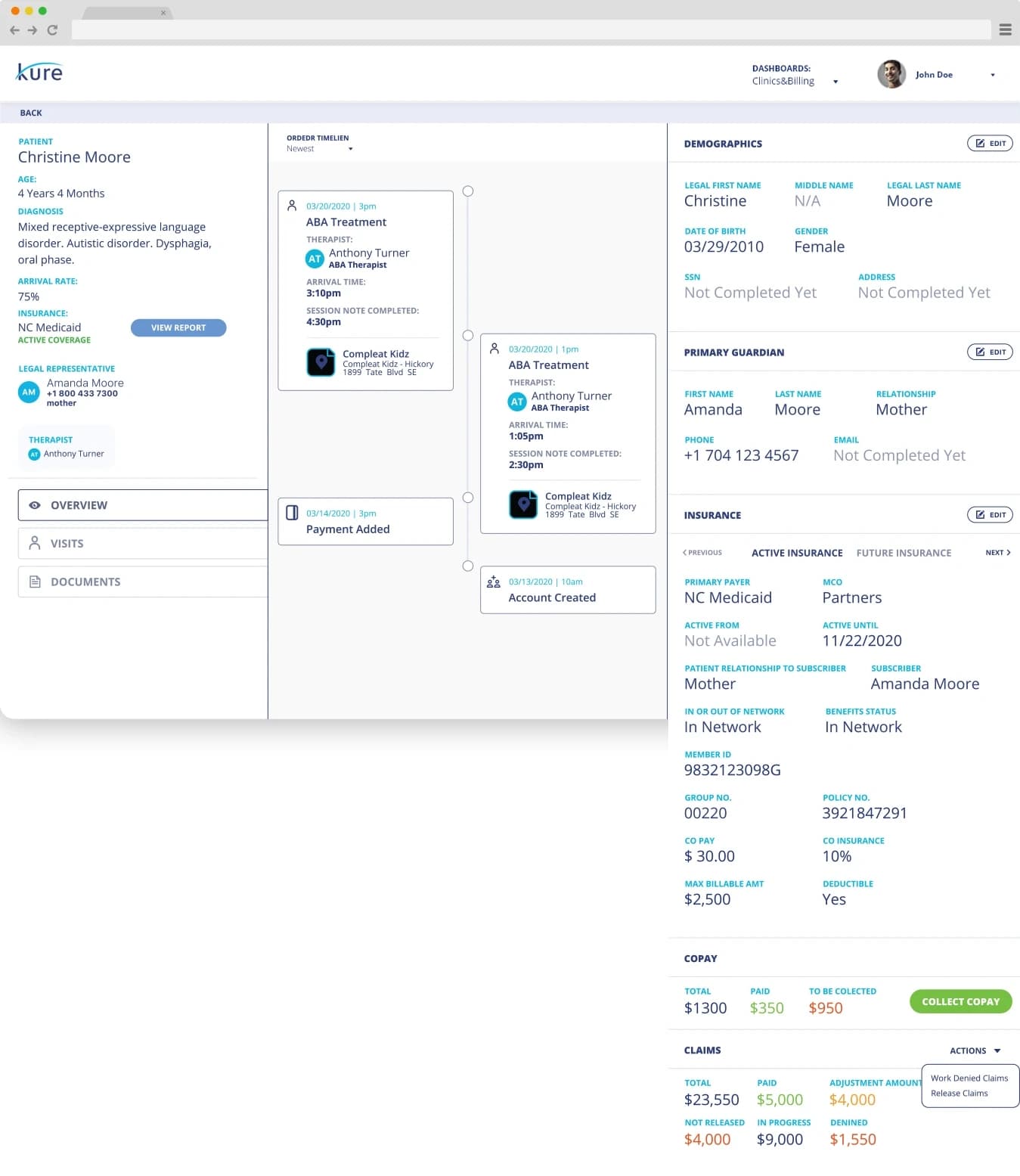
Clinics and billing dashboard
Performance, denials by code and the billings ready for release, on one page.
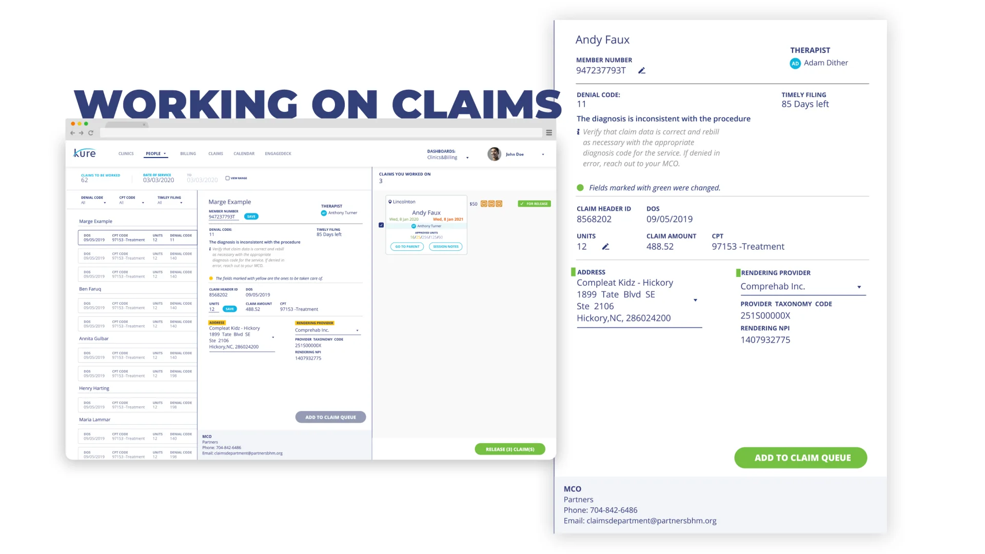
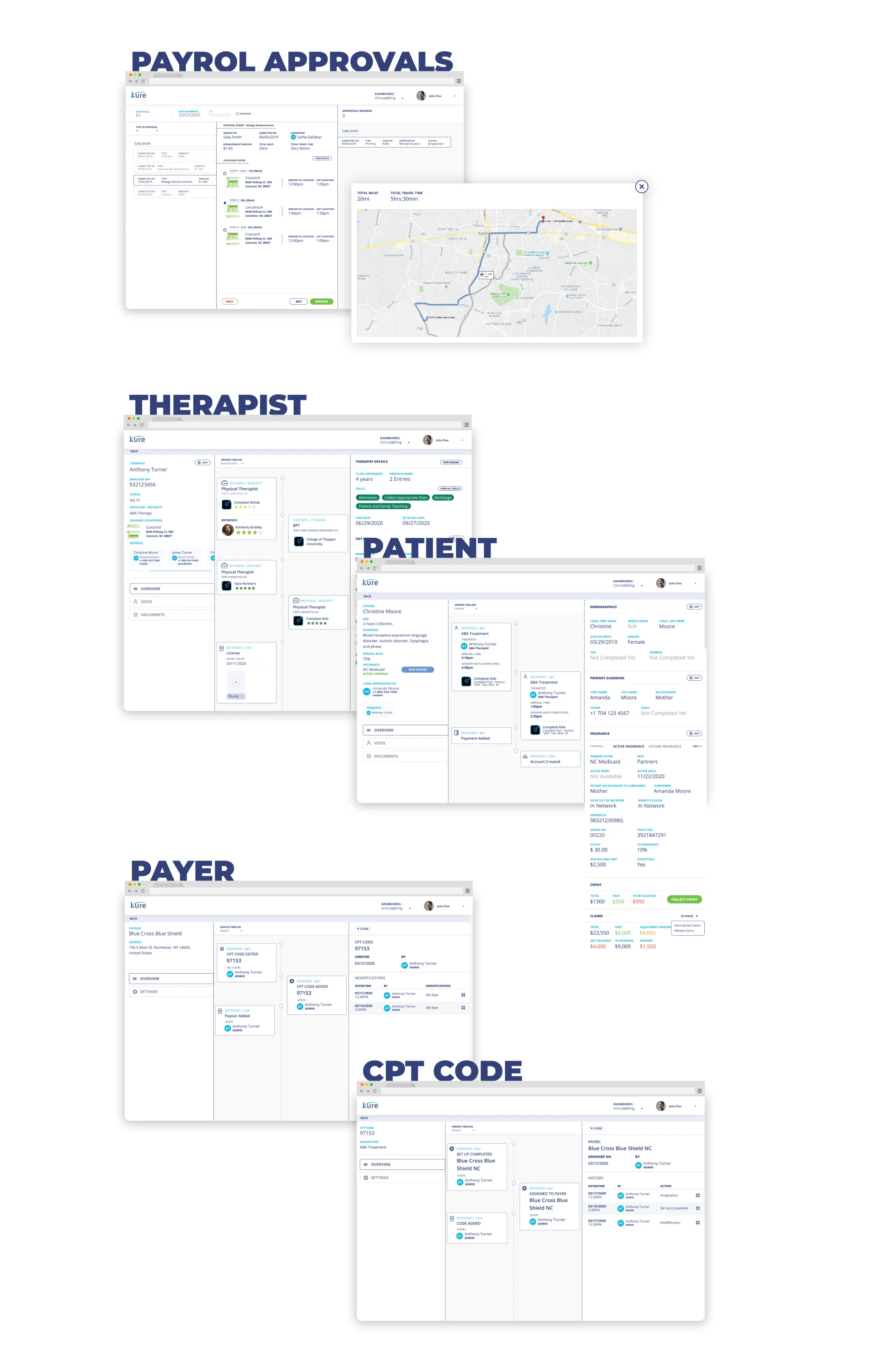
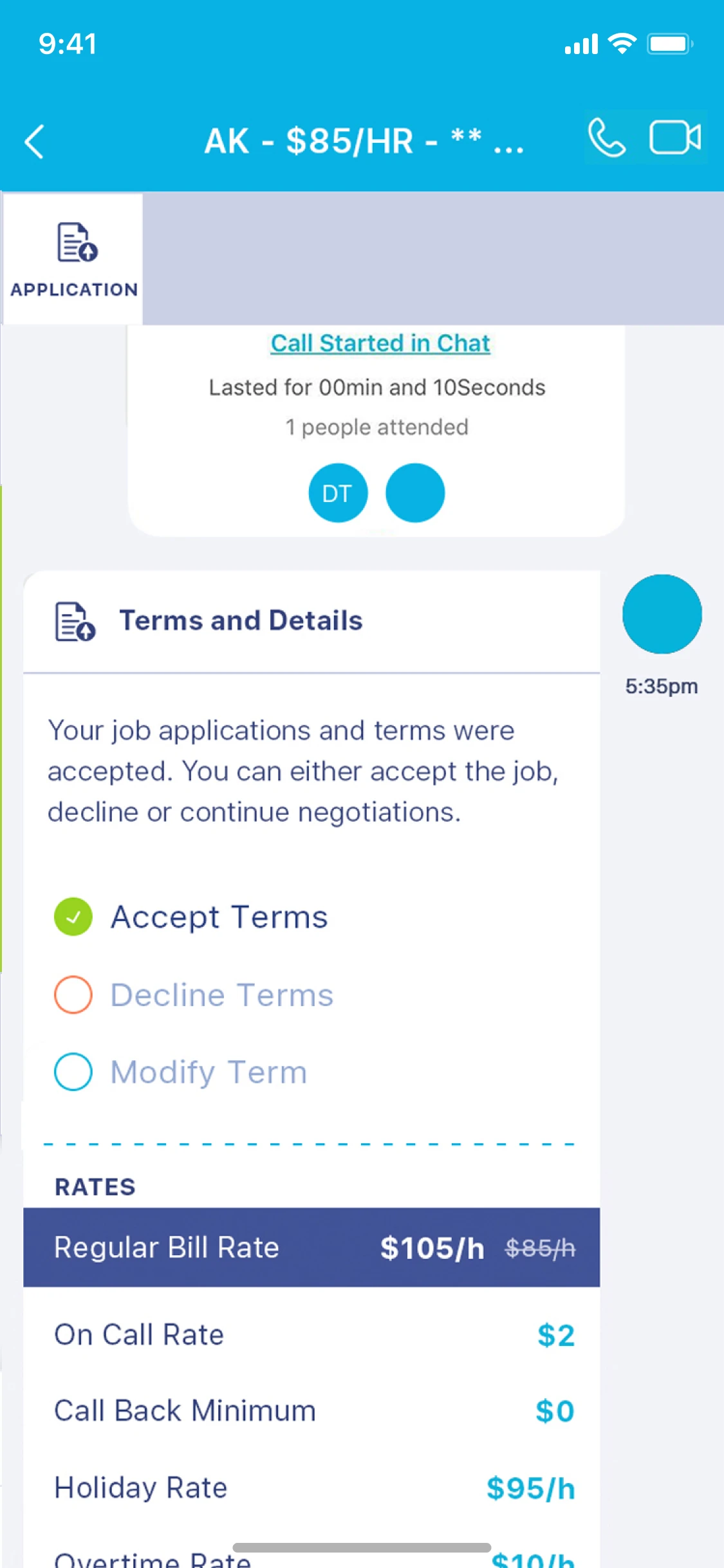
Staffing & Recruitment Flows
Clear, role-aware flows that balanced speed with compliance and accuracy.
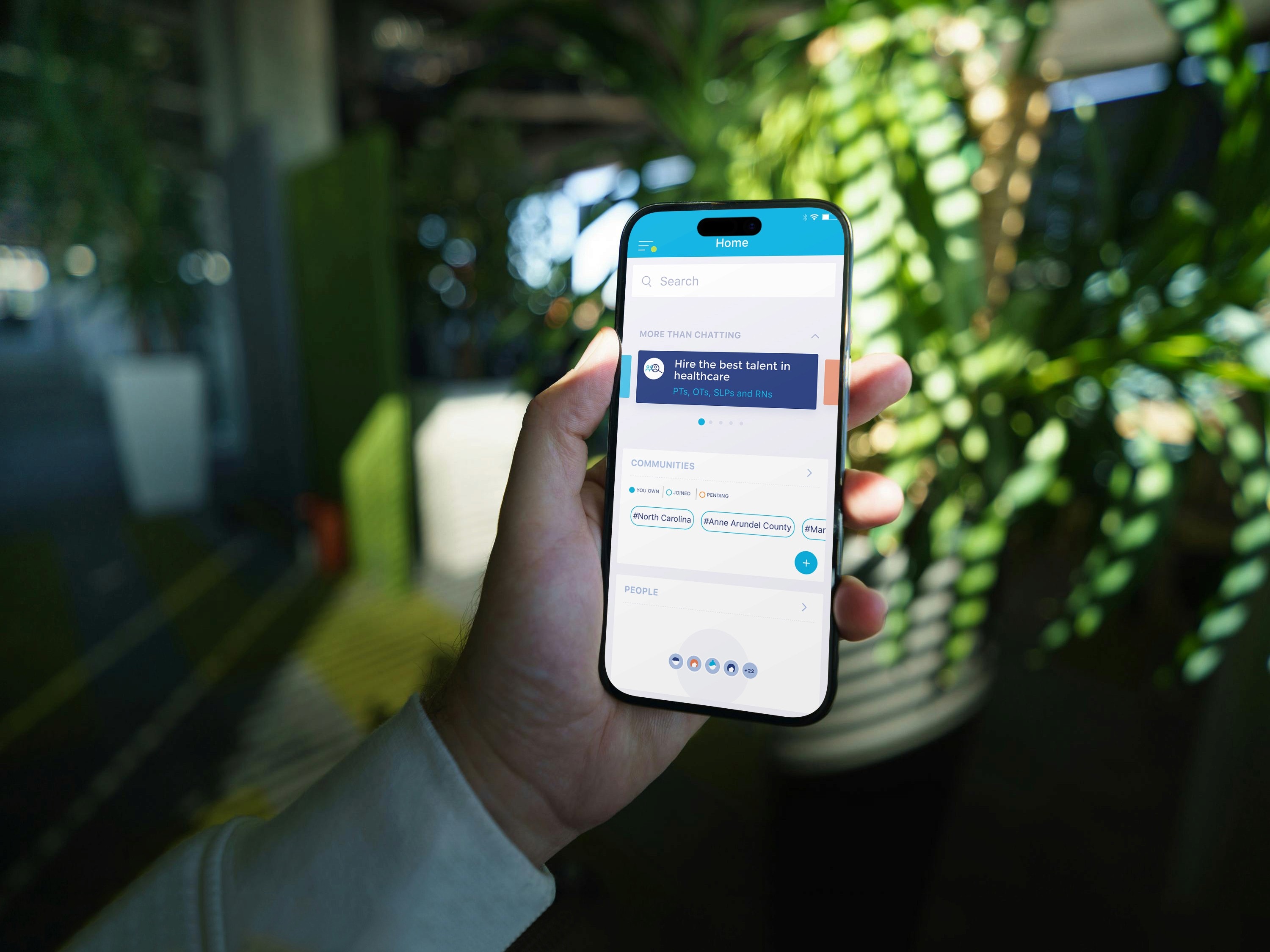
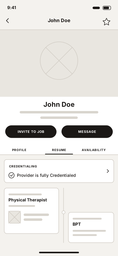
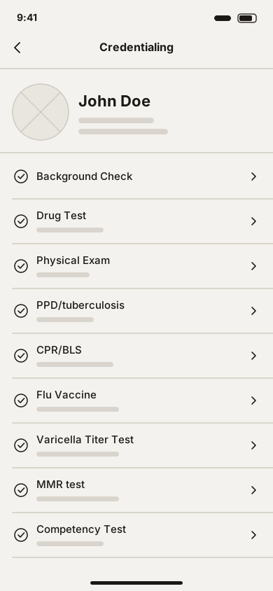
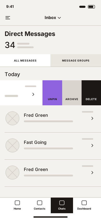
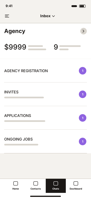
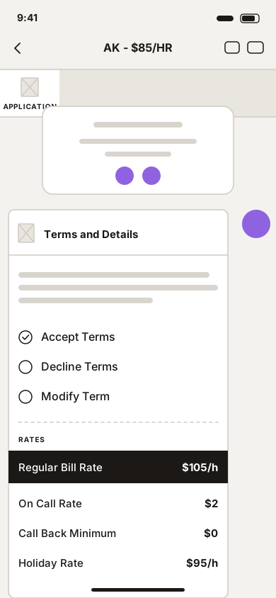
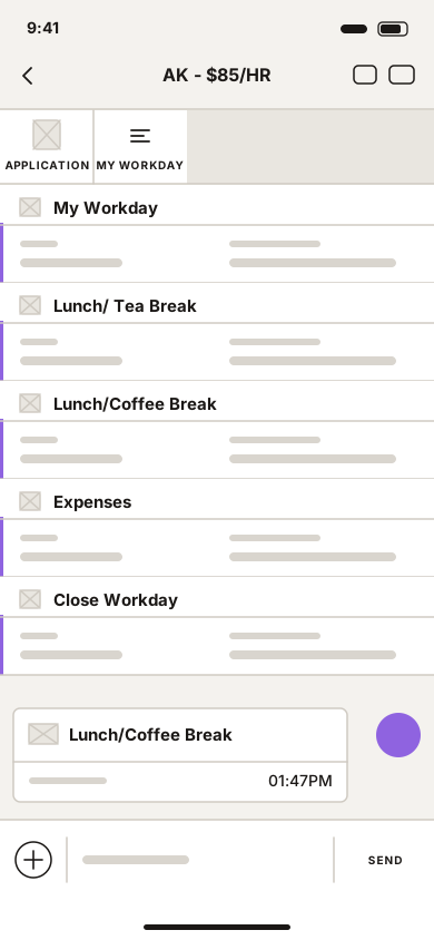
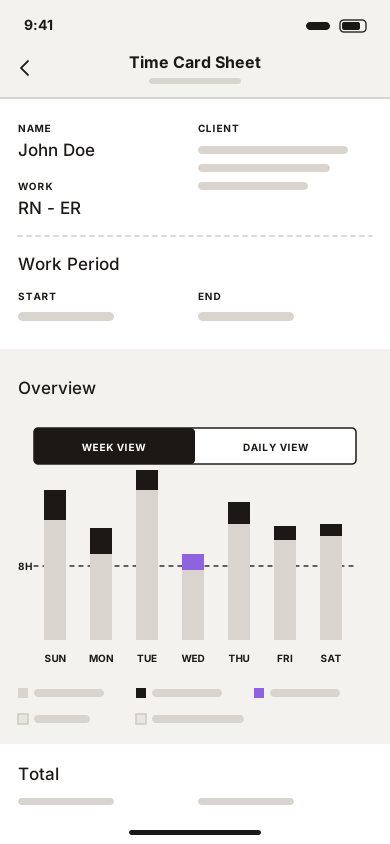
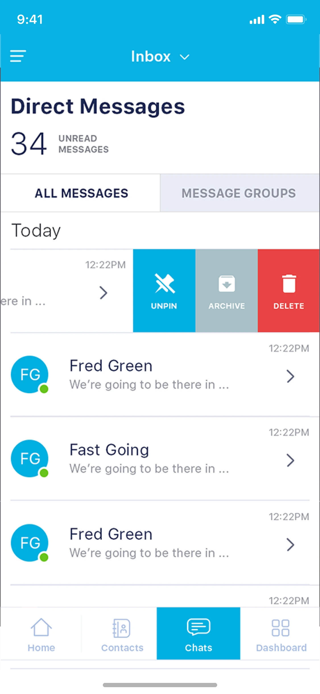
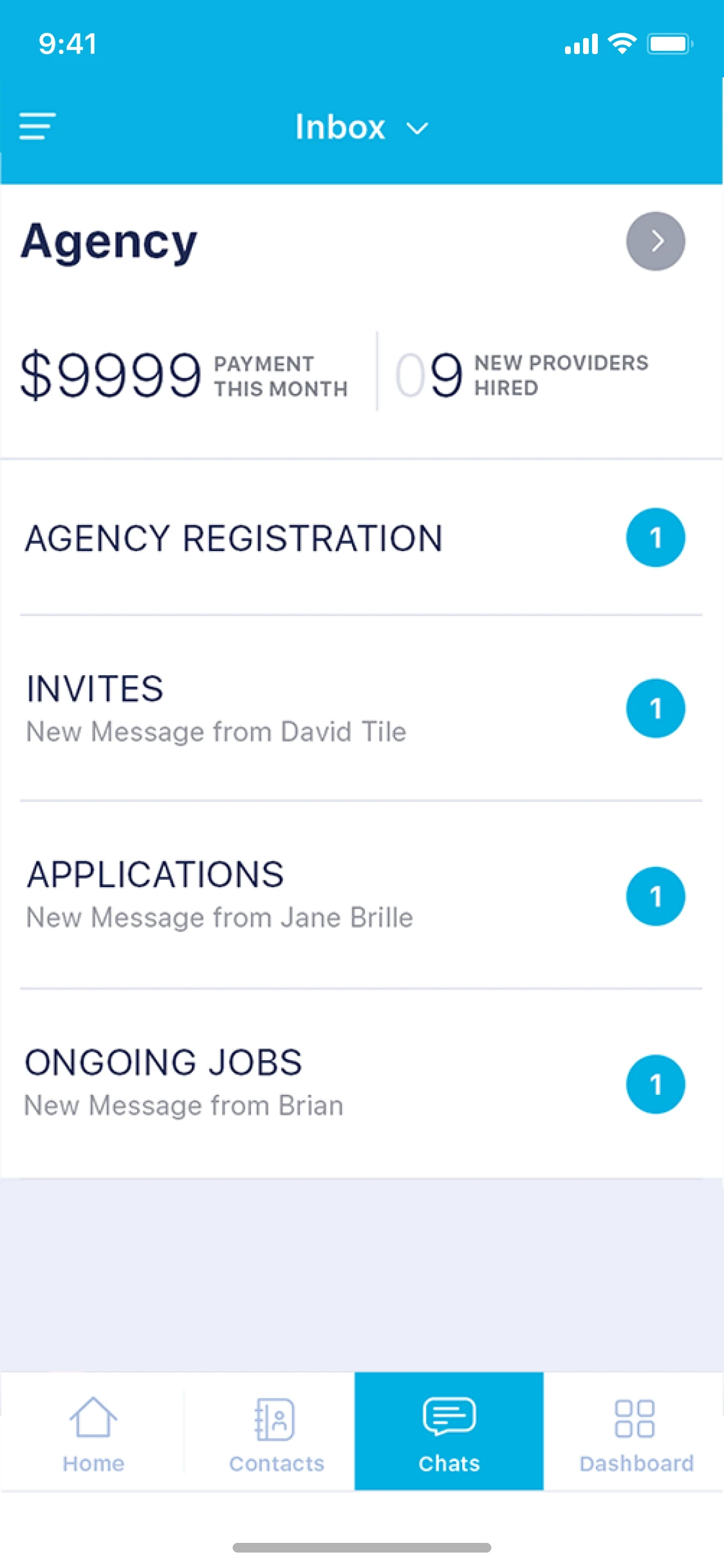
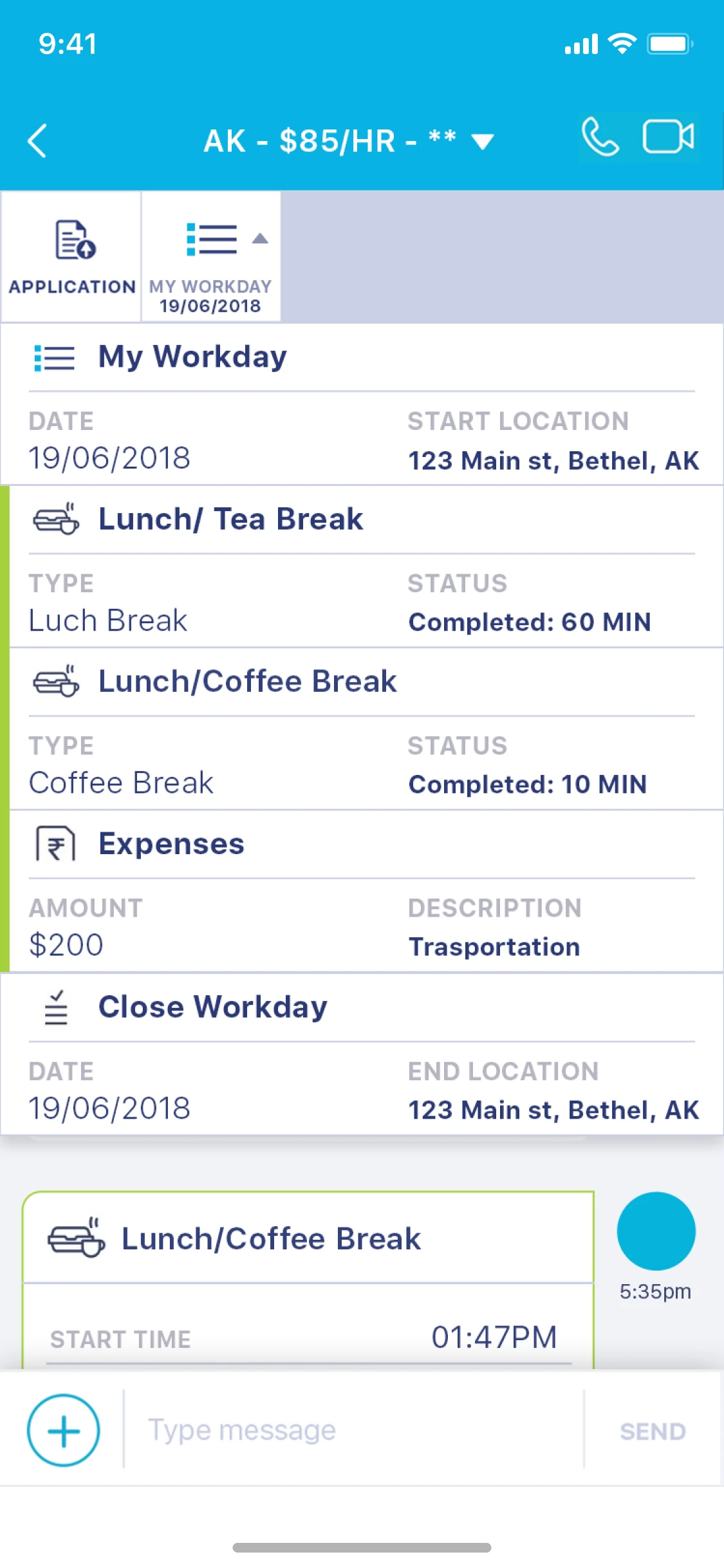
Mobile Support for On-the-Go Roles
Mobile experiences optimized for quick actions and visibility without sacrificing data integrity.
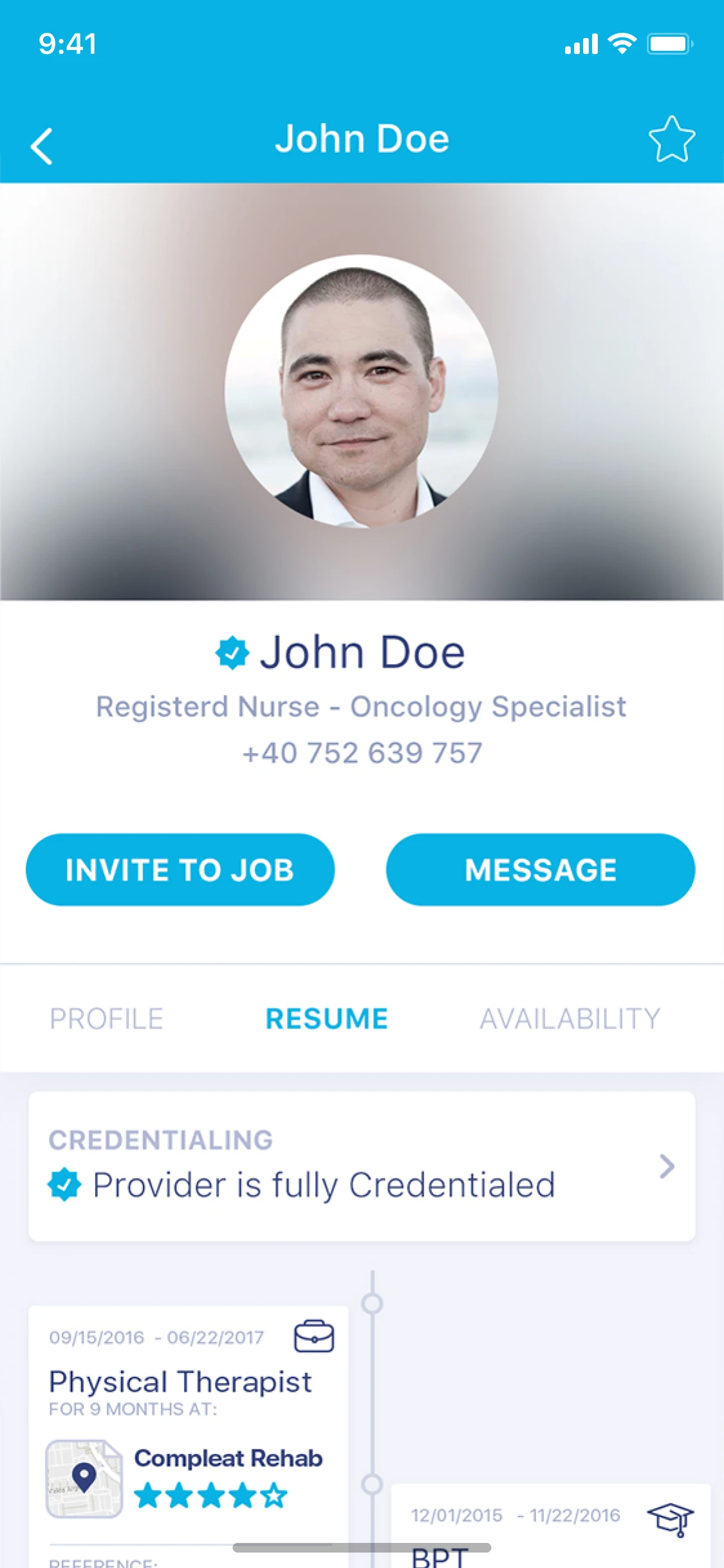
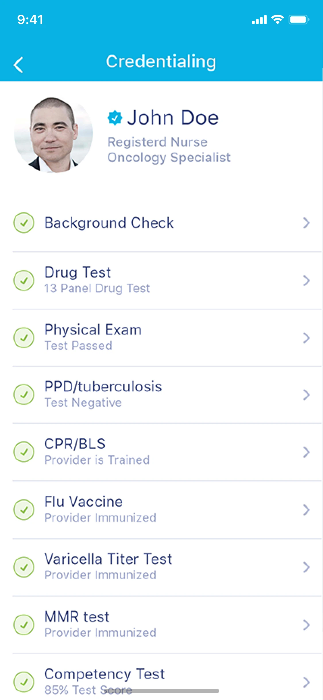
Provider profile
Who the provider is, with the two things an agency does next: invite to a job, or message.
Reflection
Kure reinforced the importance of system thinking in complex domains. Designing for healthcare operations isn’t about perfect flows, it’s about creating resilient structures that hold up under real-world pressure.
The principles applied here: clarity, systems over one-offs, and decision-making at scale, translate directly to any complex B2B or regulated product environment.