Tello
Building Tello’s Consumer Platform from the Ground Up
- Role
- Product & Brand Design Lead
- Market
- US consumer telecom (MVNO)
- Platform
- Web + Mobile
- Focus
- Acquisition, subscription customization, conversion
Tello started as a startup MVNO entering the highly competitive US telecom market, offering voice, text, and data plans to a price and quality sensitive audience. I led the design of Tello’s consumer platform, shaping both the brand experience and the end-to-end subscription journey.
Although the company already had a logo, the broader brand system and product experience needed to be defined from scratch, while meeting the usability and polish standards set by the established market.
How we got to 3× revenue growth.
Creative challenges
Entering the US telecom market meant competing against mature players with high expectations around clarity, trust, and ease of use. As a startup, Tello needed to:
- establish credibility quickly
- communicate complex plan options clearly
- enable fast, confident purchase decisions
- deliver an experience comparable to established competitors

The product experience had to work hard, both as a brand signal and as a conversion engine.
Key Value Props
Nationwide 5G Coverage, Fully customizable plans, Budget-Friendly Family Plans, Awesome referral program
Design Strategy & Key Decisions
Decision 1
Using clarity as a competitive advantage
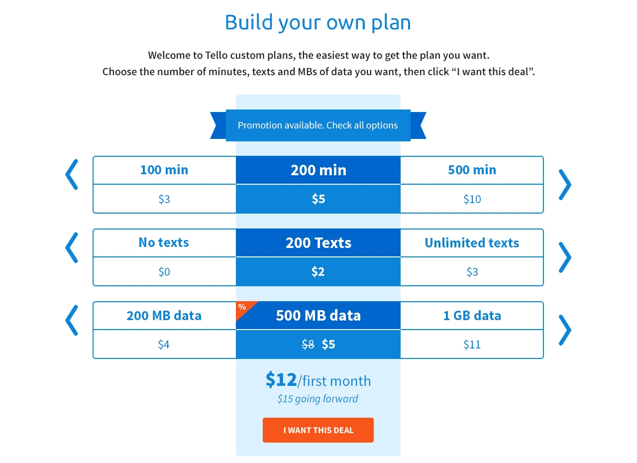
Telecom products are often overloaded with jargon and confusing pricing structures. I focused on simplifying how plans were presented, allowing users to understand, compare, and customize subscriptions without friction or guesswork.
Clarity became a core differentiator.
Decision 2
Designing the website as the product
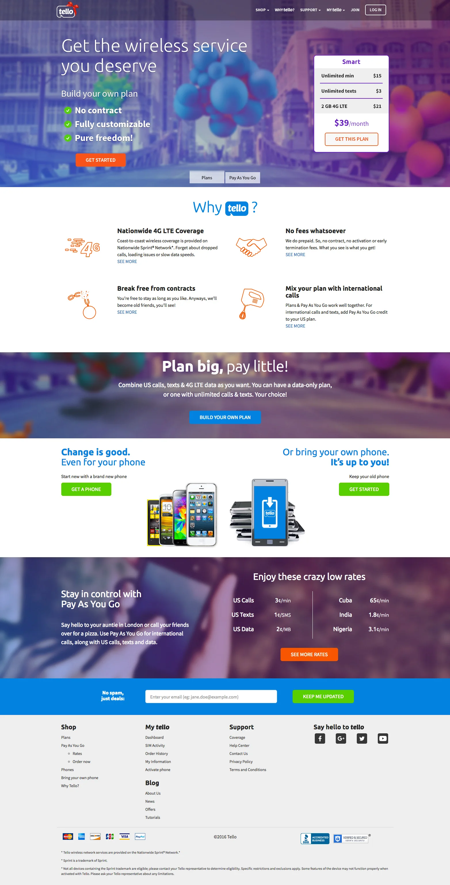
Rather than treating the website as a marketing layer, it was designed as the primary product surface, where users could explore, configure, and purchase plans in one continuous flow.
This reduced handoffs, shortened the path to purchase, and increased user confidence at the decision moment.
Decision 3
Validating early through testing
User testing informed both information hierarchy and interaction decisions, while unit-level validation ensured critical flows were reliable and predictable.
This helped surface issues early and reduced risk before handover to development.
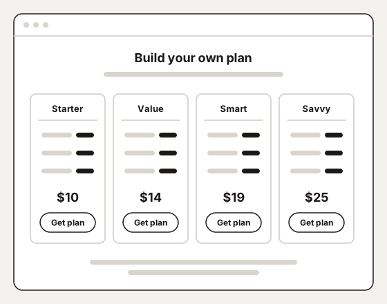
Option AFixed plans, side by side. Quick to scan, but nothing can be mixed. 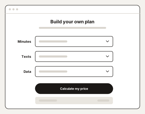
Option BThree menus and a button. Any mix, but the choices and the price stay out of sight. 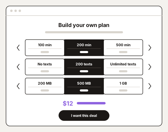
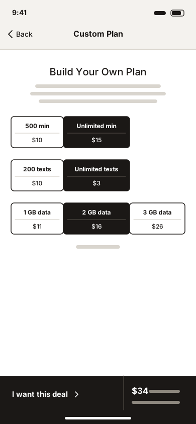
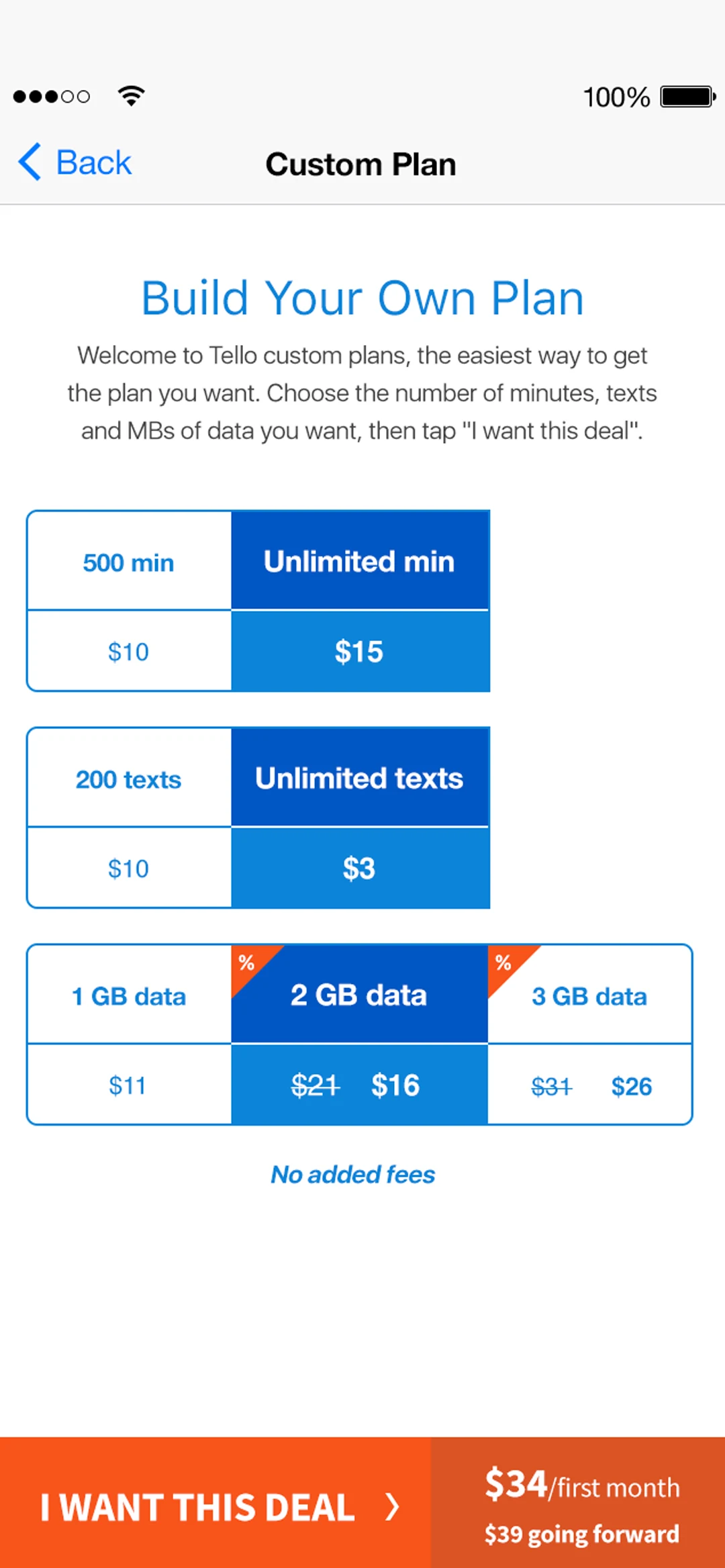
Option CThree rows, every choice in view, the price following each one.
Impact
The resulting platform positioned Tello as a credible alternative in a crowded market, supporting customer acquisition and subscription growth through a clear, conversion-focused experience.
- Competitive, launch-ready consumer platform
- Clear subscription customization and purchase flows
- Strong foundation for future iteration and scaling
- 3×
- Revenue growth
- 1.5M+
- Users connected
From Strategy to Execution
Execution focused on supporting high-intent users while maintaining a clean, trustworthy brand presence.
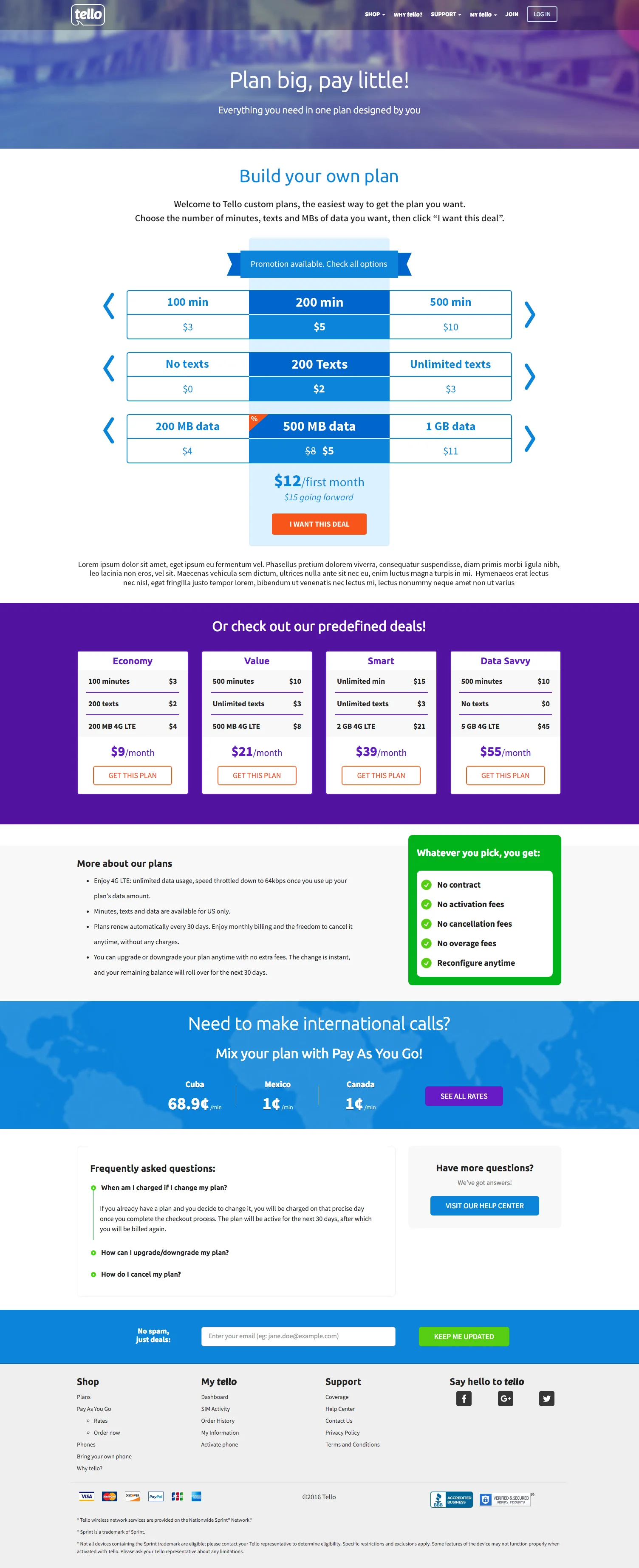
Plan Customization & Purchase Flow
Designed to make pricing and options transparent, enabling fast decision-making without overwhelming users.
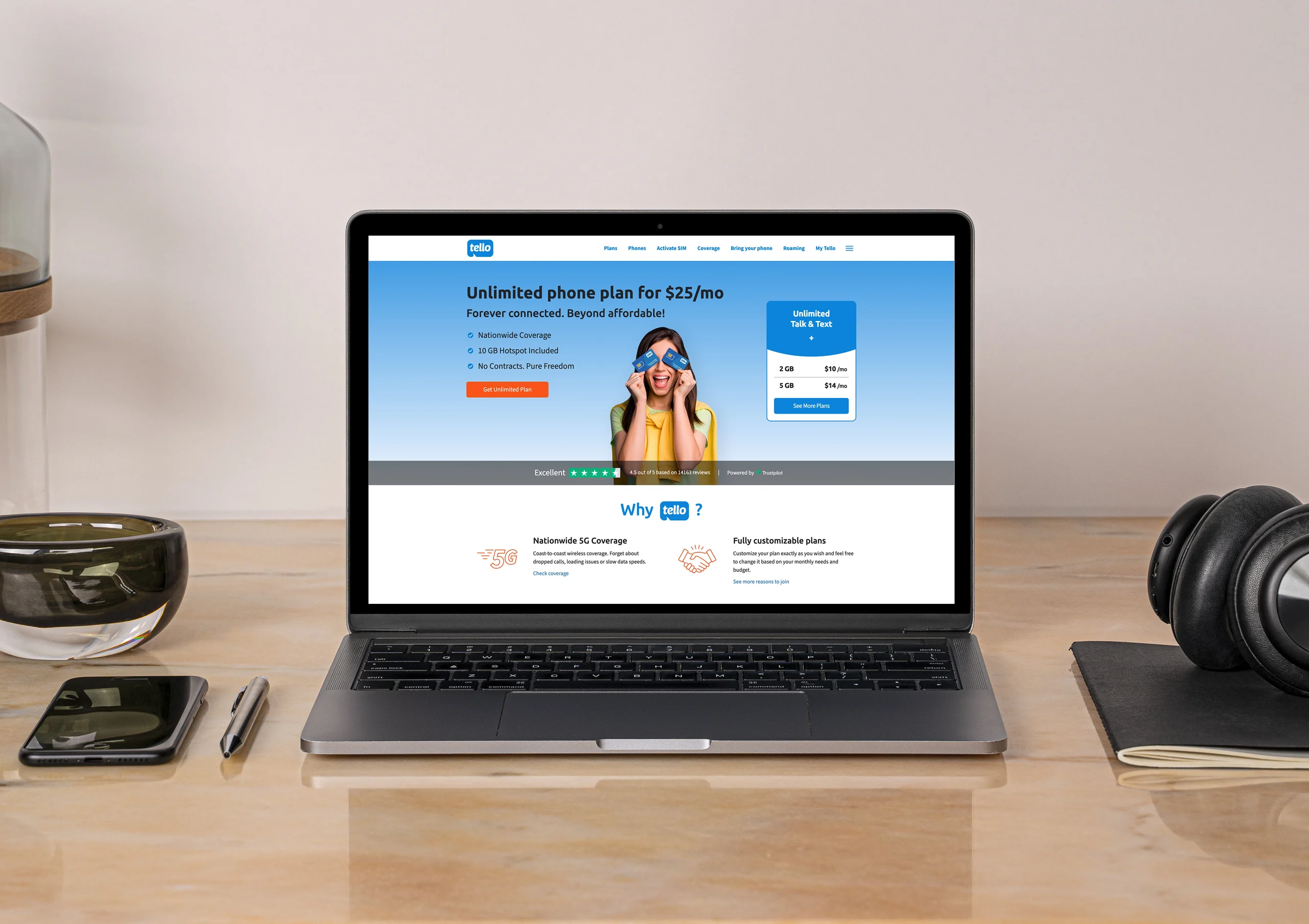
Homepage
What Tello is and a plan to buy, on the first screen; the reasons to choose it under them.
Brand Expression
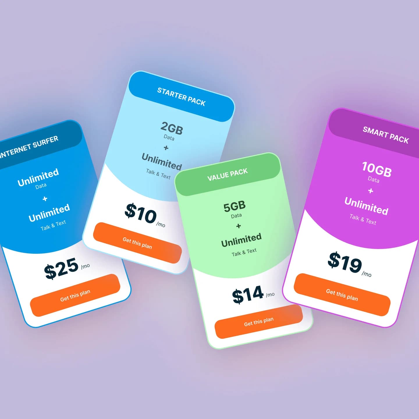
Developed a visual and interaction language that balanced approachability with reliability, helping the brand feel credible despite its startup stage.

Prototyping & Handover
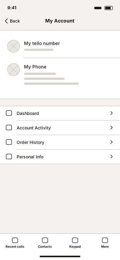
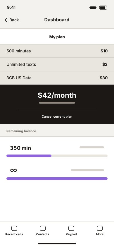
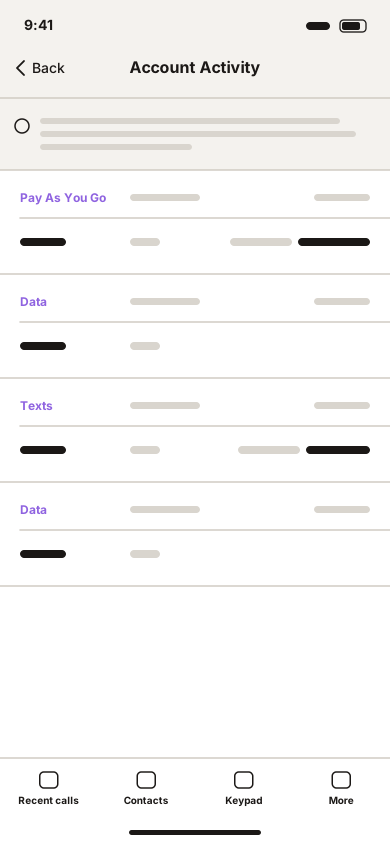
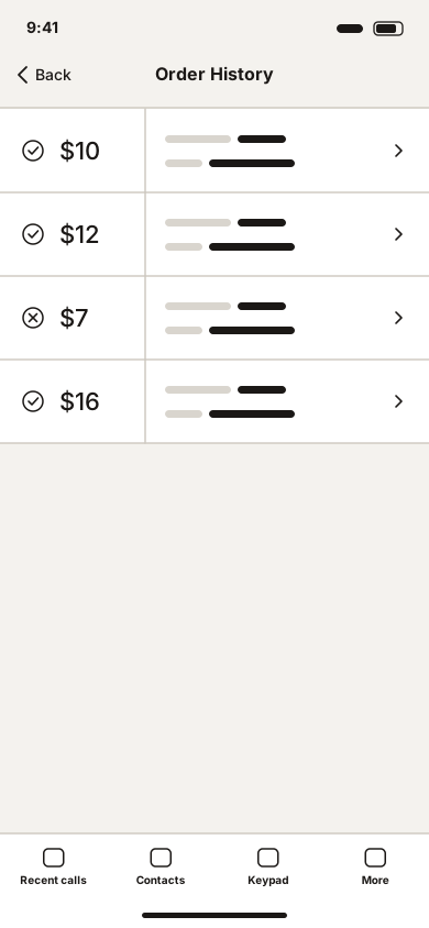
Delivered low- and high-fidelity prototypes with clear specifications to ensure smooth implementation and design intent preservation.
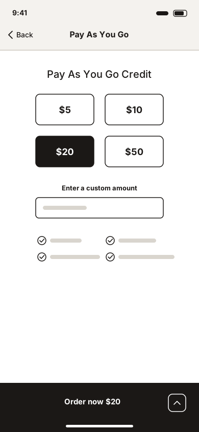
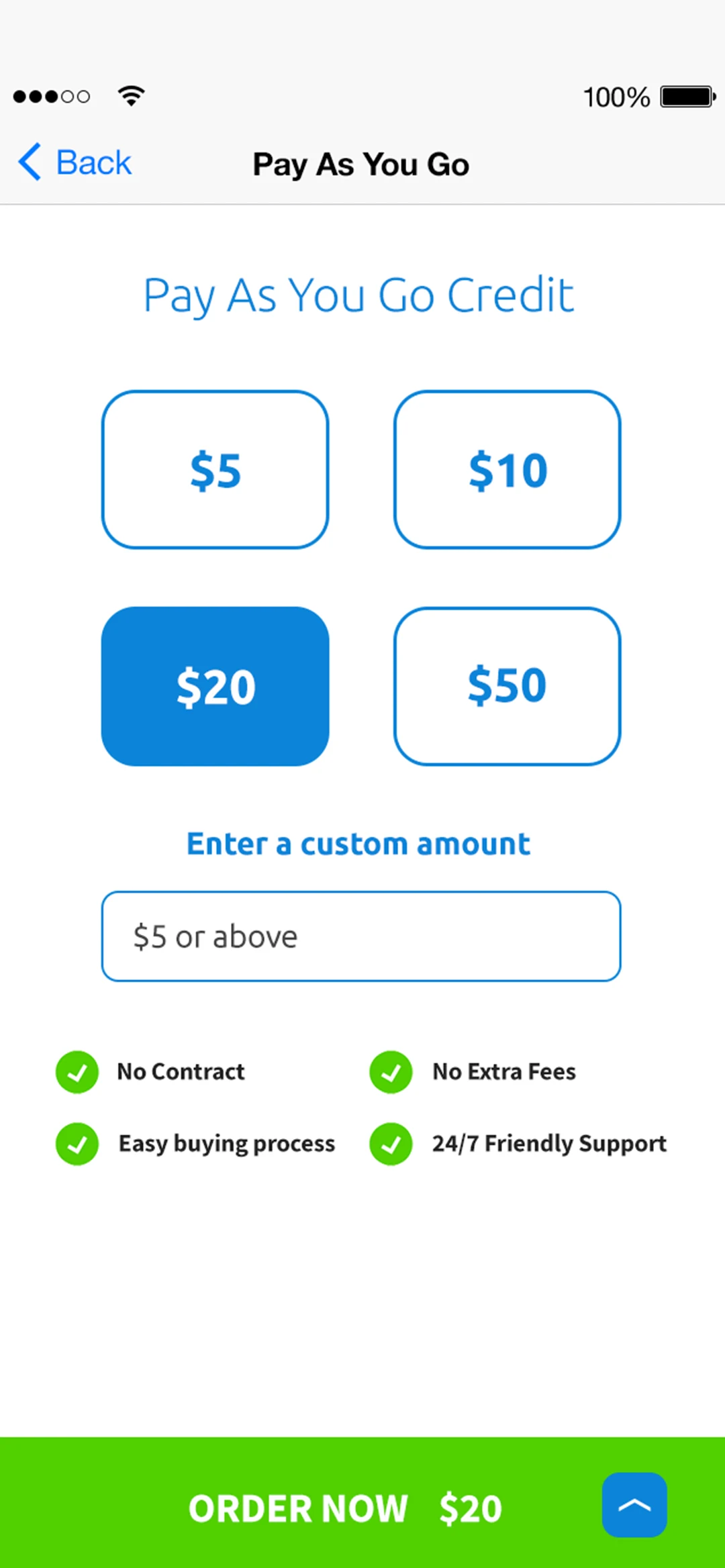
Pay as you go
Four amounts, or your own; one button to order.
Reflection
Tello reinforced how design can level the playing field in competitive markets.
By focusing on clarity, trust, and end-to-end experience ownership, startups can meet, and sometimes exceed, the standards set by much larger incumbents.